
The media does not tell us how the world is changing, it tells us what in the world goes wrong.
Max Roser, Our World in Data
Last week an article in the Guardian about the rapid increase in popularity of US national parks was widely shared on social media.
The article described how the launch of Instagram in 2010 had caused visitor numbers to a popular viewpoint above the Grand Canyon called Horseshoe Bend to grow from a few thousand a year to 100,000 in 2010, to a predicted two million this year. This had caused a dramatic change to the way of life in the nearby town of Page (population 7,000).
There are two possible ways of interpreting this story. The first is that social media is causing many more people to get outdoors and discover the wonders of the natural world. In the process, this boosts the economy and provides many more opportunities for people to work in tourism. The second interpretation is that the world’s faraway places are becoming desecrated by the tramp of human footprints, and once-peaceful communities are becoming overrun. (The article repeatedly cited the number of tourist visitations. But in case some people interpret this to mean that the return of the Messiah is imminent, I prefer to use the phrase visitor numbers.)

You can probably guess which interpretation the Guardian went for. The article was titled Crisis in our national parks: how tourists are loving nature to death, and was headed with an animated banner image of two enormous women shaped like beachballs walking towards the camera (presumably to emphasise that it wasn’t just the sheer numbers of people, but the size of them too).
The article was jam-packed with bewildering anecdotes and puzzling statistics. A Phoenix man fell to his death when he tumbled over a cliff while taking a selfie (though presumably if he was from Phoenix then he rose again afterwards). Fist fights had broken out in a car park as motorists jostled for parking spaces. There was a mile-long ‘bison-jam’ where drivers had stopped to get photos of a herd. It cost $20,000 a year to evacuate the product of public toilets by helicopter, and over 1,800 miles of toilet paper were used (was I the only person to read this and wonder how many more miles of wiping must have been done?)
But I don’t want to deliver another one of my rants where I lambast an article in the mainstream media for its sensationalism. Today I want to make a more general, positive point at a moment in time when it’s easy to believe that the world is becoming screwed beyond repair.
As I write this (and it will read differently a few years from now), if you follow the news here in the UK then it’s impossible to avoid another helping of the homemade shit-sandwich that is Brexit. The US president has made another statement that would have made Idi Amin sound enlightened. Facebook and the spread of hatred and misinformation is posing a major threat to democracy. We’re in the middle of an unstoppable global meltdown. Sea levels are rising as the polar icecaps melt. A human-triggered mass extinction is taking place that is seeing species disappear at a rate that far exceeds the mass extinction that wiped out the dinosaurs. A hundred years ago there were only 1.8 billion people in the world; now there are 7.6 billion of us competing for resources. Where will it all end?
Of course, all of these things are awful and tragic; we shouldn’t ignore them, but it’s not going to do any good to read about them all the time. And nor should we.

It pays to have a positive outlook. You can avoid the crowds of Horseshoe Bend by visiting one the many peaceful places that still exist. For example, if you live in the UK, you could visit Symonds Yat in Herefordshire, which compares favourably. The Wye Valley is a lot quieter than the Grand Canyon, especially this time of year.
In the same way, instead of reading about global meltdown and self-destructive politics, you can choose to read the good news if you know where to find it. And here I can help you.
In many significant ways the world is getting better — not just a little, but much better. If you look at long-term trends, there is no reason to suppose that it won’t continue to do so. To prove this point, I’m not just going to spew out my opinion, like I usually do. I’m going to use real data, published by reliable sources such as the UN, and analysed by gifted data scientists.
For example, here’s the great Swedish statistician Hans Rosling, explaining why it’s OK for the world’s population to grow to 11 billion, and why it won’t grow any further. This stabilisation means that there will be a much better chance for future generations to find a balance between what they consume and what nature provides.
Despite his positive message, YouTube has chosen to let the comments beneath the video become an unmoderated stream of racist filth. This is one of the world’s problems that could be easily solved by YouTube’s parent company Google. Like Google, you should of course ignore these comments too.
Hans Rosling was famous for being relentlessly optimistic about the state of mankind. He sadly died last year, and the world will miss him, but his spirit lives on in the form of an unconnected website called Our World in Data, run by a group of researchers at Oxford University.
If you’re not familiar with this site, then I’m going to give you a short introduction. It could change your outlook on life. The Our World in Data team, led by an economist called Max Roser, use publicly available data to analyse global trends over time, and report them in a plain-language, accessible way on their blog.
All of their reports are published with a creative commons license, which means I’m free to embed their graphs here. All of these graphs are interactive, so click around and hover over things to see what you can do with them.
For example, here’s an interesting one on global poverty over the last 200 years, which shows poverty plummeting down the side of a mountain. This is a good thing. You will see that 95% of the world’s population lived in extreme poverty in 1820 (that’s living on the equivalent of less than $1.90 a day). Now this figure is less than 10%. If you’re reading this, then the chances are your family was among those whose lives have improved.
If you watched Hans Rosling’s video, you will know one of the reasons for recent population growth is a decline in infant mortality (children dying before the age of five). Hans was keen to point out that this is something to be celebrated, not lamented.
Our World in Data’s graph for this is not quite as dramatic as the poverty one, but it’s still a steep slope that you can ski down. It shows that 43% of people who were born in 1800 didn’t reach their sixth birthday. In 2015 that figure was down to just 4%, and it’s still falling.
These two graphs focus on survival. But how about quality of life? There is an interesting one on freedom, which analyses the different political regimes that people live under.
In 1816 less than 1% of the world’s population lived in a democracy. Now 56% do, and although 23% live in an autocracy, 80% of these are accounted for by a single country, China, which is in the process of knocking the United States off its pedestal as the world’s biggest superpower.
I could go on, and show you similarly dramatic graphs for education, literacy, hunger and vaccination against disease, all of which suggest that although the world’s population is increasing rapidly, you could argue quite strongly that we are adapting to deal with it. Not only is the population increasing, but we are living better lives.
Not all the reports are quite so emphatic, but most have encouraging signs. For instance, last month they published a report on changes in inequality over the last 25 years. We tend to think that inequality is increasing. In some places it is, but in others it’s falling. In the UK, it’s actually been static (though this was pre-Brexit).
The surprising thing about the graph below is that it’s all over the place, with no obvious trends. This suggests that inequality is driven more by government policy in individual countries than global trends. This is something that those of us lucky enough to live in democracies are able to influence. We can voice our opinion and vote for the candidate or government that is most likely to care about these things.
This graph may need some explanation. It uses a measure called the Gini Index for inequality, which is higher the more inequality that exists. The vertical axis shows the level of inequality in 2015, while the horizontal axis shows inequality in 1990. Countries where inequality is lowest can be found towards the bottom left of the graph; those where it’s highest are at the top right. In countries above the line, inequality is increasing; in those below the line it’s going down (which is a good thing). The best country for inequality is Denmark (though Ukraine and Slovenia are hot on its heels). The very worst country for inequality is comfortably South Africa.
Even the graphs about man-made climate change offer a glimmer of hope. Take this one, for example, which shows CO2 emissions per capita since the Industrial Revolution.
For the first hundred years, the UK was the America of its day and the world’s main industrial nation. But since the 1970s our emissions per person have declined, as they have in most developed countries, including (would you believe it) the United States.
This suggests that more recently expanding economies such as Japan and China will follow a similar trend. Global initiatives such as the Sustainable Development Goals and the Paris climate agreement should help with this. It also suggests that (contrary to what you may have read in the media) developed countries are addressing climate change, even if it may not be quickly enough for some.
(If you really want to make your jaw drop, click on ‘Add country’ in the graph below and add Qatar.)
Anyway, that’s enough of statistics. I’m not going to pretend everything in the world is rosy, but it’s a lot more promising than you might believe from watching the news.
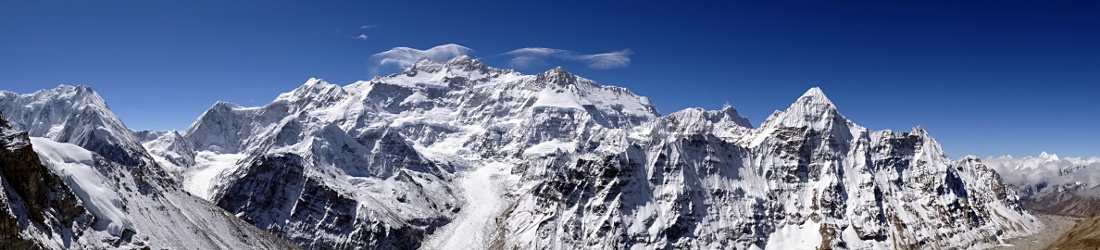
The point I’m trying to make is that you shouldn’t let articles like the one about Horseshoe Bend put you off visiting amazing places, and nor should you try to deter others. Nor do you need to stop visiting mountainous places just because the glaciers are receding (as this article of two halves published in a developing country desperately seeks to point out).
If you want to adopt a vegetarian diet, fly less often by plane (I wouldn’t recommend flying by another means), join a march, switch off geotagging on your phone, or wear an extra sweater instead of putting on the heating, that’s fine. These small actions are drops in the ocean, but every drop causes ripples.
But there’s no need to wring your hands and get too hung up about it when you hear the mountains are becoming more crowded. In the same way that population growth is a result of lower infant mortality, the crowding is due to greater wealth and freedom of movement. It’s a good thing, not a bad one.
And before someone posts a comment to remind me that climate change is real, we know this. We are seeing its effects very clearly now, but it’s important that we balance all the doomsday stories we read about in the media with a healthy dose of the good news too. The truth is usually somewhere in the middle, and the good news helps to keep us sane.
I used to be pessimistic about the world we’ll leave behind for future generations. It will certainly be different. It will be a warmer world with fewer species and smaller glaciers. That will be a tragedy, for sure, but I could liken this to another of life’s unavoidable tragedies. One day everyone we have ever known and loved will die. How sad is that thought? The best thing is not to think about it; we are adaptable and we will deal with it when it happens (and the CO2 graph shows we’re already working on it). All of this data demonstrates clearly that the richer, better-educated children that we hand our world on to will be able to cope.

But some of you are probably thinking that this blog is supposed to be about mountains, and instead I’ve been banging on about statistics. It’s time I mentioned a mountain again. You’re right, so let’s do that. A short distance away from the aforementioned Symonds Yat, overlooking a bend in the River Wye, are the Black Mountains of the Welsh border. Rising among them is a peak on a gentle escarpment called Lord Hereford’s Knob.
If that doesn’t bring a smile to your face, then I don’t know what will.


Blimey Mark, I normally look forward to your posts as a bit of light early evening read with a beer or two. I’ve had to put this little rascal of a post for pre-breakfast totally sober concentration but nevertheless very relevant and I shall look forward to tackling this beast in the morning. Keep them coming, love the read and the lightheartness of it all.
Her in New Zealand, Lonely Planet Syndrome is alive and well. The well-publicised places are busier than ever, which leaves most places quiet for us Kiwis. Example: on a six day 85km trip in the mountains with the Nelson Tramping Club in late September, we saw no one else on days 2-6.
Even here in the Peak District National Park – the second busiest in the world – it is relatively easy to find solitude. Buy guide books, look up the routes, then ignore them and go somewhere else. The great majority of tourists are incredibly conservative and wouldn’t dream of going to other than “official” beauty spots
Interesting post. A couple of pedant points to prove I’ve read it properly : i) before the Rosling YouTube, reference to “11 million”, should be 11 billion; ii) child mortality stats refer to “share dying in first 5 years” ie. not reaching their 5th birthday, not their 6th as stated in the preceding text.
Secondly, I like Rosling’s stuff but I sometimes fear he extrapolated existing trends without fully considering possible future trend changes. The pessimist in me fears that we live in the best of all possible worlds and recognises that there are so many things which can go wrong from here, whether it’s nuclear proliferation, pandemics, antibiotic resistance, failure to reduce fossil fuel burning anywhere near quickly enough etc. Plus it would be interesting to see some other charts eg. global changes in wildlife vs. domesticated animals over time; global changes in land use eg. reductions in forests, increases in cultivated land over time. They wouldn’t show such a rosy picture.
Finally, I quite agree, I always have an extra spring in my step when I’m climbing a hill with a rude name. I’ve done Lord Hereford’s Knob, The Devil’s Point, Brown Willy and last summer I finally made it around the Paps of Jura. The Pap of Glencoe has so far eluded me.
Ha, those other charts are available. You won’t need to look hard to find them.
Anyway, I bet myself a fiver I wouldn’t have to wait long before a gloom-monger posted a comment which contained a list of all the bad things happening in the world, so thanks for winning me my bet.
Now your homework for this weekend while you’re climbing Fan y Big (missing from your list I see) – think of all the good things, then come back and atone for your sin by posting them here. 😉
Hi Mark, great blog post. Just wanted to point out a small typo in the text, “11 million” should obviously be “11 billion”.
Hello Mark, how could I forget Fan y Big? Turns out I bagged it in 2002 when I was doing the Nuttalls. I must have got an extra frisson of satisfaction at its conquest but sadly it escapes recollection now.
The best thing about being a gloom-monger is that things very rarely turn out as badly as expected so it’s easy to be happy. “Reasons to be Cheerful” by Ian Dury is a good place to start for good, happy things. Or just the simple joy of being in the moment on a hill and everything being perfect and then something amazing happens like nearly stumbling on an adder and then cautiously observing it or getting to a trig point after an exhausting plod and finding a crow sitting on it watching you and you think “it’s alright for you, you cheated” or falling waist deep into a boggy stream and laughing after you’ve extricated yourself.
Thank you, Owen. You are now forgiven 🙂
Your blog is really brilliant and this post is a great reminder that in between the doom & gloom and alarmist news, there is so much wonder and beauty to discover. I love to hike and to enjoy a nice dram afterwards, the best may at times bring a tear to the eye as I marvel at how such a delicious thing exists for me to enjoy. Thanks again for the read.