
I’m reaching the final stages of my crusade to publish a book about my ten year journey to the summit of Everest, and am keen to have your feedback about two very different concepts we have in mind for the book cover.
The book will be called Seven Steps from Snowdon to Everest, and describes the journey I took and the mountains I climbed as I progressed from being an ordinary hill walker to high-altitude mountaineer.
I provided a thorough brief to my designer, Andrew Brown of Design for Writers, emphasising a number of key concepts.
Some of the more important ones were:
- The book is intended to have popular appeal, and attract all readers who enjoy the genre of travel writing, not just Everest and mountaineering enthusiasts
- The book is about an ordinary guy chasing an extraordinary dream, against the odds
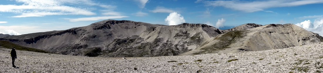
- The book is not just about Everest, but other mountains and other places
- This isn’t just another epic mountaineering disaster book: while mountains can be hostile, they are also places of beauty
- In particular I wanted a cover that would make the book stand out from other books about Everest
We have two very different concepts for the cover: a photographic one, and one involving artwork.
The feedback I am looking for is very specific, and I would be grateful if you can answer the specific questions I have in the comments.

At this moment in time I am strongly favouring Concept B, the artwork.
Before I go down this route I just need a quick sanity check from people who read my blog and are familiar with my writing, to ensure I will not be confusing potential readers about what sort of book they are buying.
My three questions are:
- Which concept do you prefer: A or B?
- If you were looking at book cover A on Amazon, what other book(s) does it remind you of?
- If you were looking at book cover B on Amazon, what other book(s) does it remind you of?
For questions 2 and 3 feel free to suggest any book – it doesn’t have to be a book about mountaineering.
Thank you so much for your feedback. I plan to publish Seven Steps from Snowdon to Everest as an ebook in November/December, and eventually as a paperback as well.
It will be available to buy pre-launch for half price, hopefully in September. You can subscribe to my email newsletter for updates.
[EXCITING UPDATE 2 SEPTEMBER 2015 – THE BOOK IS NOW AVAILABLE TO PRE-ORDER!]


These are both really strong covers. You’re lucky to have such a great designer!
1. Overall I prefer the second cover, but it’s a close one. I think it fits the content and tone of your book better, and I also think it will make the book stand out in the genre.
2. The first image is fairly typical for the high-altitude mountaineering subgenre, such as Higher Ground by Martin Moran, Savage Arena by Joe Tasker, Life and Limb by Jamie Andrew, more or less anything by Joe Simpson.
3. The second image borrows design cues from travel literature, which often uses graphics instead of photographs. This is a clever move because it subtly places your book in a slightly different category to the ‘ripping yarn’ style of mountaineering book – yet there is no risk of it being confused with a typical travel book. The typography is also stronger and the stylised character is far more prominent. The colour is more vibrant. Overall it does the job you want it to do more efficiently than the first cover.
If you are looking for a popular audience I think concept B. A is definitely a mountaineer’s book I like the concept of B but not the actual design which looks a bit like a book on management.
I prefer cover A
But it is rather generic and resembles a lot of other books. Just picked up “One Day as a Tiger from” my library and it very much the same style.. But that does not mean I don’t think it is a good cover
Cover B looks like a children’s book or Mountaineering for Dummies and is, to me, rather repellent. But then I am a boring old fart seeped in a long tradition of bof book collecting. 🙂
I’d pick B every time. A just looks a bit scary and like every other adventure/real life book on the shelves. B feels like it’ll be more inspiring and attainable – like I might be able to follow in your steps.
Hope that helps and I’ll be sure to buy a copy!
Tim
I prefer cover B. By a distance. It looks fun, fresh and I think would have much wider appeal.
Cover A reminds me of loads of books…’No Way Down’, ‘The Climb’ etc. So maybe that’s a good thing!!
Cover B reminds me of ‘One Man and his Bike’.
TBH – I’d buy either.
Hi Mark, I hope you’re well. You’ll know by now that I never miss an opportunity to have my two penneth, so thanks for the invite! 😀
1. Both covers look great but I don’t prefer one over the other because I don’t feel that either quite achieves what you’re setting out to do (see later).
2 & 3. If I was looking at the book covers on Amazon…
A would make me think right away that it’s a serious mountaineering saga about Everest, and from the large red lettering I would infer that some drama and/or tragedy was involved.
B immediately says to me ‘self-improvement book’, especially with that title. I can just imagine the accompanying blurb – “Do you want to be the envy of everyone at the local climbing club or impress girls down at the YHA? Just follow these seven simple steps and you too can reach the summit of the world’s highest peak! ”
I’ve read some of your previous posts about the book Mark, and it’s clearly about your journey from hill walker (glad you dropped the word ‘lowly’) to Everest summiteer. Both of these covers look fantastic but neither of them say ‘journey’ to me, which is what your story is all about. If I had to choose between one or the other then I would go with Concept B because it gives the impression that the book will be a lightweight and humorous read (even with your jokes!), rather than a factual account of mountaineering ascents.
Hope that helps and good luck with it all. I’ll certainly get a copy whichever cover you choose 🙂
Cheers, Matt.
1. My initial gut instinct choice was for cover A, as I tend to be more drawn to serious books when it comes to mountaineering, but when I stopped and considered your style of writing I realised cover B was probably a better fit.
2. Cover A reminds me of most of the ‘serious’ style books on the market, so in that way it doesn’t actually ‘stand out of the crowd’ at all.
3. Cover B reminds me of books by writers like Bill Bryson, which is not a million miles off your kind of style. But whilst I think cover B may be more suited to your style of writing I actually seriously dislike the actual execution of the concept.
Having worked in publishing in the past, I would say neither cover achieves quite what you should be looking for. And having read the comments above I think that’s the general consensus. Stick with concept B but find someone who can execute it better, as someone above wrote, it does tend to put you in mind of a ‘self help’ or ‘climbing for dummies’ type of book rather than a humourous collection of mountaineering exploits.
Mark,
I will have to second Sarah’s suggestions. With a little tweaking, I believe that the second one could embody a Horrell type adventure while the first does tend to appear formulaic.
Either way, I am looking extremely forward to the completed work.
Hi Mark,
I agree entirely with Sarah.
Looking at the covers as they are now, I much prefer A. The problem with A is, though, that it looks rather generic and as others have said the red lettering makes one think of drama. It could actually also be the cover for a thriller set in the mountains. (BTW, I like the title, unpretentious and understated).
The concept of cover B fits your style of writing a lot better, but I also dislike the actual design. It looks more like “Office bloke climbs Everest, and you can do it, too” instead of “Hill climber goes on long journey to achieve the goal of climbing the highest mountain on earth”. In my opinion the mountain is too much alike to computer images. And I’d much prefer a figure in walking boots and clothes and with a backpack to a guy with a tie. At the moment it does not reflect that you were already an experienced hill climber before setting out on your journey.
I don’t know if this would actually work, but maybe the two concepts could be combined: mountains above and hills below the title, but as art?
Anyway, I am looking forward to your book, whichever cover you decide to put on it.
Ann
Don’t think I can add anything that has not already been said…A seems like books I have by the dozen,B is something fresh but is a wee bit too cheechee.Sure it will be OK on the night
Cheers
Marilyn
My 2p: Yes, A looks like a lot of other mountaineering books, but does to me convey the journey from Snowden to Everest, and to me is a lot more appealing. Who doesn’t like a picture of a mountain?! As someone who possibly takes things a little too literally, B irritates me because who doesn’t stand on Everest with a yellow banner in a tie and a big smile? Although to be fair, the likeness is very good, I can see where he was going with that… And your journey was from Hillwalker to Everest summiter, not office worker to Everest summiter. OK, you may have worked in an office environment, but that’s not the point? But, I am also yer archetypal grumpy late 40 something who has loved reading your books and will be stumping up in September!
I much prefer cover option A because it shows mountain scenery, which is where the books are set after all. Cover A reminds me of books like Into Thin Air, and will attract those who like to read about climbing expeditions. I really don’t like Cover B because it makes it look as if it isn’t a serious book. It’s like those unfunny Queen Betsy vampire humour books with cartoon covers to make you think the book is some funny story and you read it and go ‘is that it?’ I know you want to appeal broadly to people but most who pick up your book are climbers or wannabe climbers or those who like walking, photography or other people’s adventues. I love reading mountain climbing books but if I saw cover b I would assume the book was a parody of climbing and ignore it for something that looked like a proper mountain expedition book instead.
Definitely not B, and consider a new title.
Without being too harsh, the title sounds self helpish, and I would not buy myself any book covered by B. Why 7? 7 Mountains: A Journey to the Extraordinary. 7 Climbs in Search of the Top.
Any chance we can read some of it before the release tonhelp in suggesting a cover?
I am currently reading Omnibus, and found your website through searches for the Doug Scott on Ogre story. Thank you for your coverage of the great mountaineers and their presentations.
Thanks everyone for all the really helpful feedback. I’ve been overwhelmed by the positive response I’ve had from people of all literary tastes here on the blog, on Facebook and on Twitter.
The horse has bolted now, and I’m more convinced than ever that concept B is the route to go down (I shudder with horror every time anyone uses phrases like “Into Thin Air” and “serious mountaineering book” with reference to concept A). Andrew is now working up a variant on concept B using the many useful suggestions I have received.
And for anyone who is curious, the title of the book isn’t in question. I’ve been working with variations of Seven Steps from Snowdon to Everest for eight years now, and I love it, but I do rather like the idea people might buy my book thinking they are getting a self help reference manual. All the more reason for sticking with concept B, and I hope they enjoy it more than the book they were intending to buy. 😉
I am the “general, non-climbing public”, but I have read several of your/ Mark’s ebooks as well as many other books about travel, adventure and climbing. Some people read mysteries for light reading…I prefer travel and adventure yarns.
I actually found concept B a big turn-off.
The B cover looks like a self-help or motivational book, and the title “Seven Steps” compounds that. As does the suit and tie. As does the cartoonish concept. Business how-to/ self help/ how to succeed book…yuck! Consequently I don’t think that this cover B is of interest to the general public that is looking for a good travel/ adventure/ climbing read. (Tip for your survey: ask the people who are responding what demo/ psychographic group they would be in. If climbers and adventurers are telling you this would appeal to the general public…well, how would they know?)
Concept A is generic, but at least is consistent with the daydreams of adventure the “general public who would be interested in Mark’s books” has. BTW, I do not believe that people do books by their covers, definitely not online. Most readers are going to go by the description/ genre/ search terms and their perusal of sample content, so a cover trying too hard to appeal to a different target group is not going to work anyway. (My humble opinions, worth at least what you paid for them.)
Ahem. OK, thanks most of you for the positive response, including all my (predominantly non-climbing) friends on Facebook, who gave very helpful feedback as well.
Voting is now closed, and I am very happy with the decision I have made.